How weather becomes fractal art
By Spinnybarr, developer of Wynspira · Updated October 11, 2026
Wynspira gives weather two views: the numbers you need to plan your day, and a branching animation that makes changing conditions feel different. The animation is built from forecast inputs. It is not a photograph of the sky, a lightning detector or a storm-warning system.
What changes the visual?
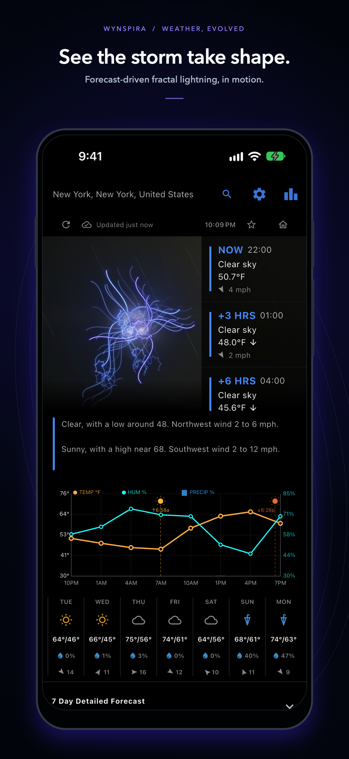
The fractal is a branching drawing generated by the app. Its appearance combines weather inputs with deliberate artistic rules. Different inputs can produce similar shapes, and motion can change the frame even when the forecast stays the same. Treat it as a companion to the weather display, not a way to measure conditions by eye.
- Temperature: a changing color palette
- Cooler inputs favor blues, warmer inputs move through purple and orange, and hotter inputs reach yellow tones. These are visual choices rather than official weather-warning colors. Check the displayed temperature and unit instead of estimating degrees from a color.
- Humidity: the spread of the branches
- Relative humidity influences how widely the drawing spreads. Humidity describes how close the air is to saturation at its current temperature; it does not, by itself, establish that rain will fall.
- Precipitation probability: more opportunities to branch
- Higher forecast precipitation probability increases the likelihood of splits in the fractal. A busy drawing does not mean intense rain, and it does not mean lightning has been observed. Rain probability and rainfall amount are separate readings.
- Wind: movement in the scene
- Wind speed and direction influence visual motion. The animation is not a calibrated wind vane. For travel or outdoor planning, read the wind values and distinguish sustained wind from gusts where those readings are available.
- UV and pressure: depth and taper
- The UV input influences how many levels the drawing can branch through, while pressure influences how branches taper. These mappings add variety; neither the visual depth nor the taper is a scale for sun exposure or a forecast of an approaching storm. Use the displayed readings and appropriate official guidance.
Try a useful comparison
- Open the web app and search for a city you know. You do not need to grant GPS access to search manually.
- Read the location name and current temperature first. Check the unit setting so that Celsius and Fahrenheit are not confused.
- Look at the hourly chart and detailed forecast slots. Compare a cooler period with a warmer one, then compare periods with different rain probabilities.
- Search for a second location and compare the numbers as well as the visual. A change of color may be easy to notice, but the forecast tells you whether a coat, rain cover or a change of plans makes sense.
Example: two places, two different questions
Imagine one city at 8°C with a low rain probability and another at 28°C with a higher rain probability. The second may use a warmer palette and more branching. That comparison says nothing about an actual thunderstorm: you still need the weather description, wind forecast and any official alerts to understand the conditions. These numbers are an example, not live readings.
Where does the forecast come from?
Wynspira obtains global weather forecasts through Open-Meteo, which combines output from numerical weather models. For supported U.S. locations and territories, the app also uses National Weather Service forecasts and alerts. Coverage and available fields differ by location and provider.
Open-Meteo's current conditions are based on 15-minute weather-model data. That is a data timestep, not a promise that a nearby instrument was read in the last 15 minutes. Underlying models update on different schedules, and some fine-interval data is interpolated. A model grid cell can represent a wider area than your street, particularly around mountains, coasts and urban heat islands.
The app and backend cache responses to avoid repeatedly requesting the same information. Opening a panel or tapping refresh does not necessarily trigger a new model run or a new provider request. The global extremes snapshot is fresh for 30 minutes and refreshes when requested after that window. See the extremes guide for its coverage and failure behavior.
What the app cannot tell you
The fractal is not evidence of nearby lightning, a tornado, flooding or any other hazard. Its branching, brightness and color should never be used as warning thresholds. A visually calm scene also does not establish that conditions are safe.
Forecasts can change between model updates, and local weather can differ from a modeled value. Missing fields should not be read as zero wind or no rainfall. For urgent decisions, use current information from your local meteorological service and emergency authorities. Do not delay action on an official warning while comparing the animation.
Wynspira is developed by Spinnybarr as a weather-viewing and creative visualization app. Questions or feedback about the visual mapping can be sent to spinnybarr@gmail.com. Location and advertising choices are explained in the privacy policy.